
This interactive data visualization provides insights into the lives of all Nobel Laureates from 1901 to 2016. The information is encoded only through color, shape, size, position and animation. No alphanumeric characters or pictographic representations of any kind have been used.
The data visualization is designed as a system of visualizations. It consists of three screens, each showcasing a different aspect of the data set. Additionally each screen has two or three states.
Intro Screen
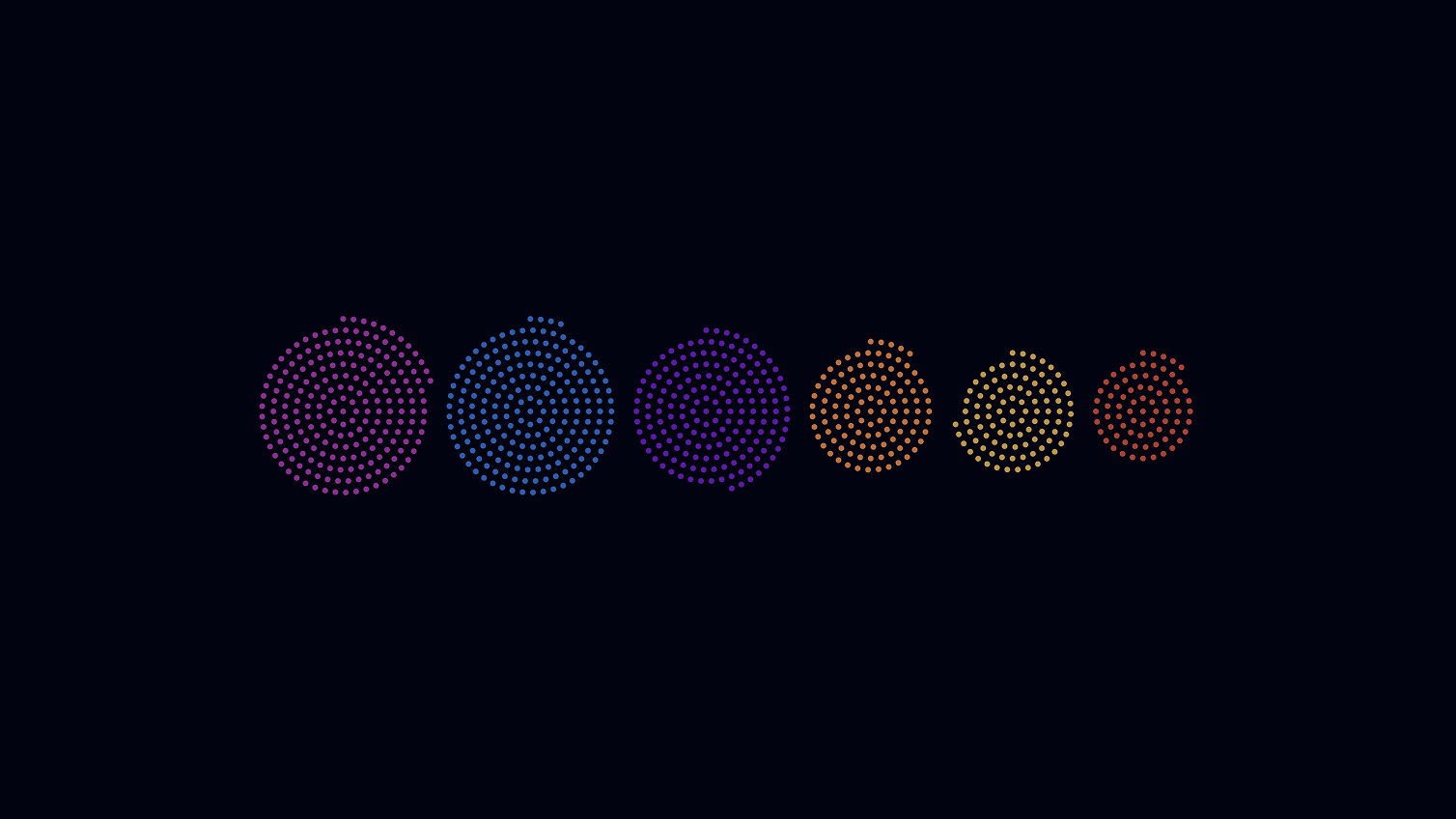
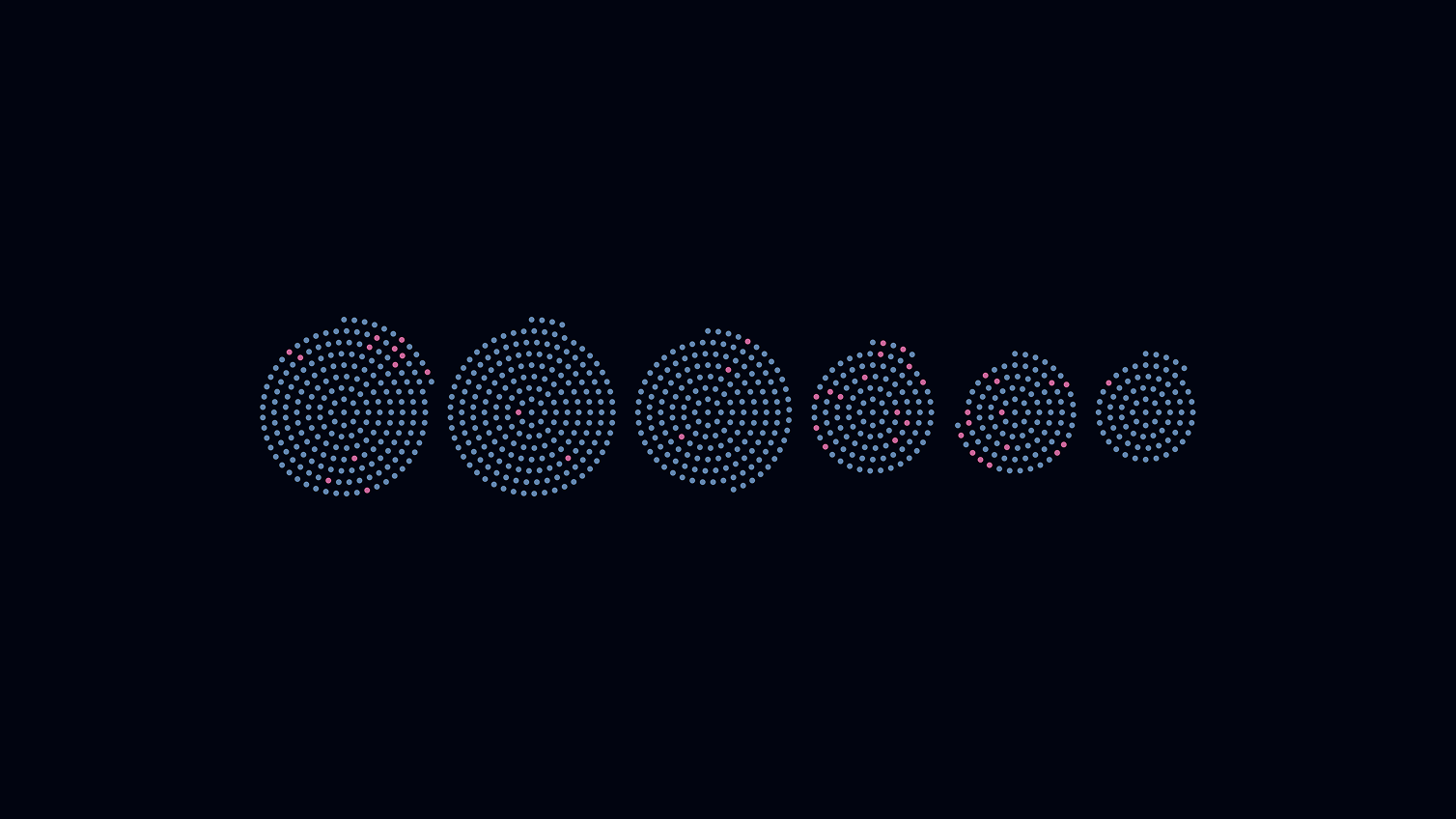
The intro screen is made up of two views. In the first, the award winners are arranged in two clouds of dots, separated by sex. The other view shows the grouping into the six award categories.
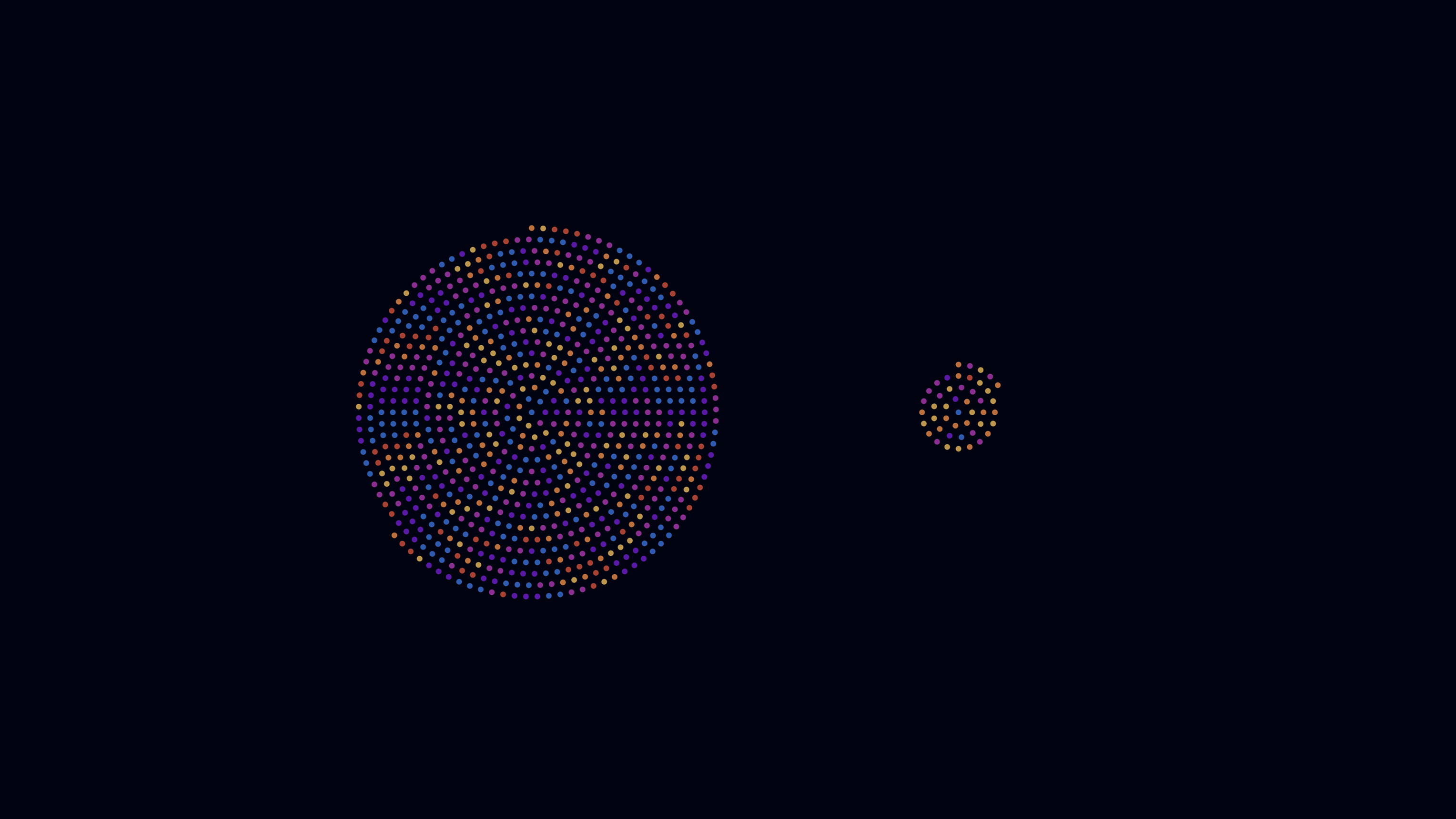
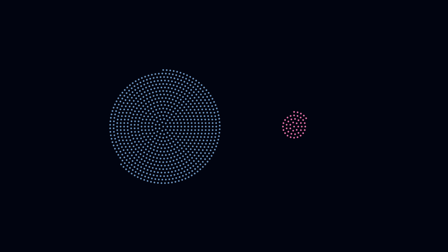
Grouped by sex
Grouped by nobel prize category
These seemingly simple compositions are complemented in content by the two colour codes (by gender and by category), in that the user always has the option of switching between the colour codes in order to add another level of comparison to the representations.
Grouped by sex, color coded by category
Grouped by nobel prize category, color coded by sex
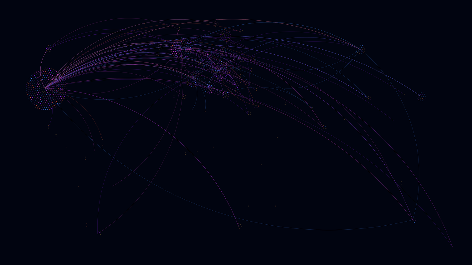
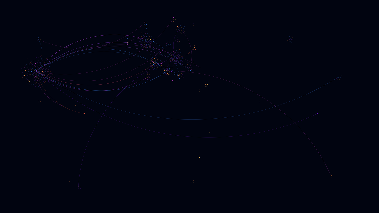
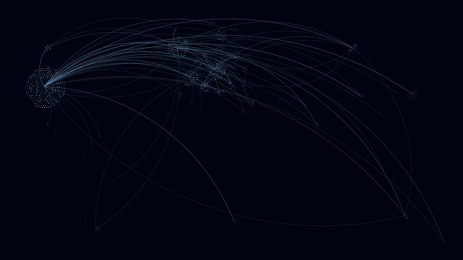
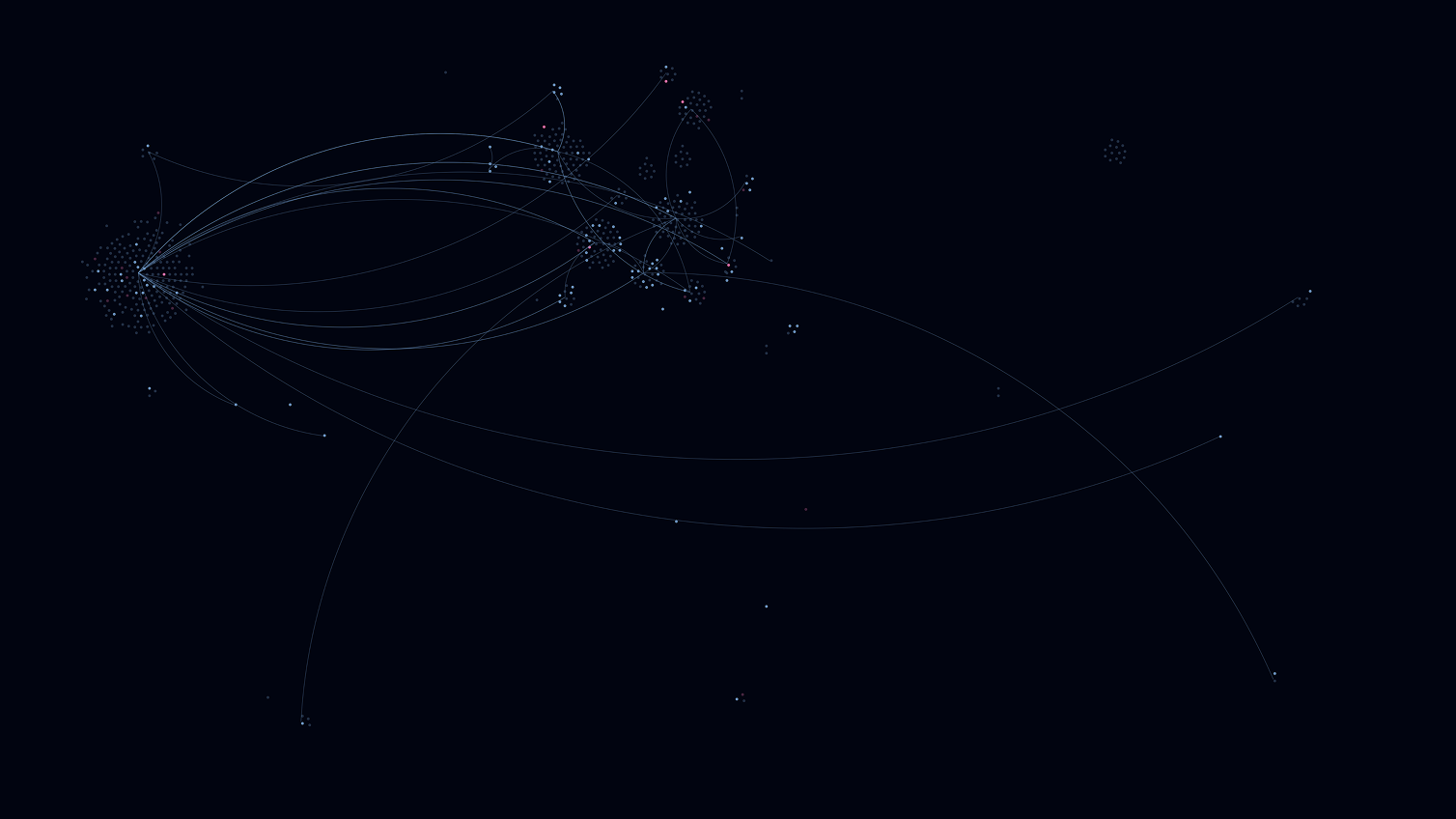
World Map
The geographical distribution of the laureates is visualized on the map. Each laureate is represented by a dot, which resulted in the point clouds. In total, there are three views of the world map, showing where the laureates were born, where they did their research and won the prize, and in which country they ultimately died. Lines between countries indicate migration behavior of the laureates.
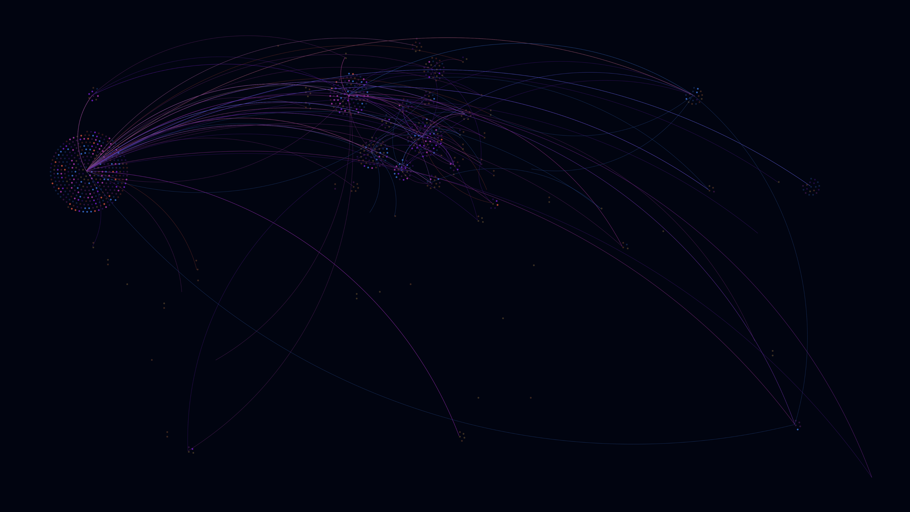
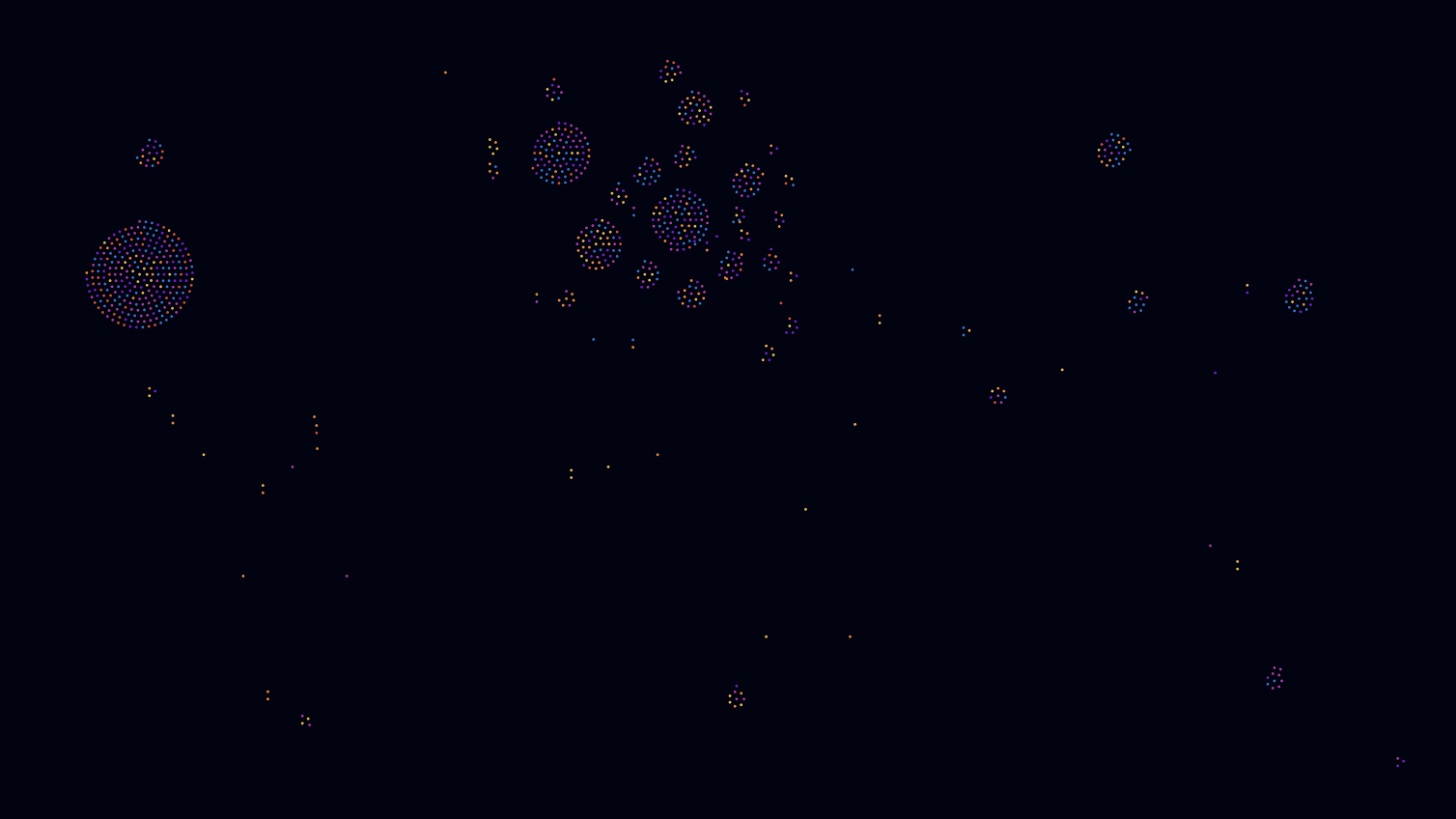
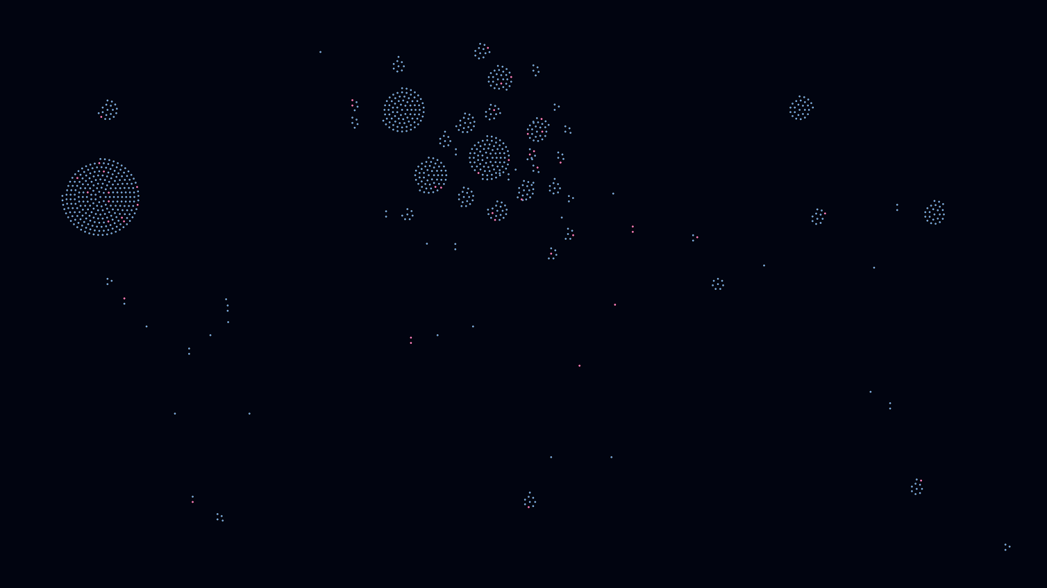
Country of birth
Country where research was conducted
Country of death
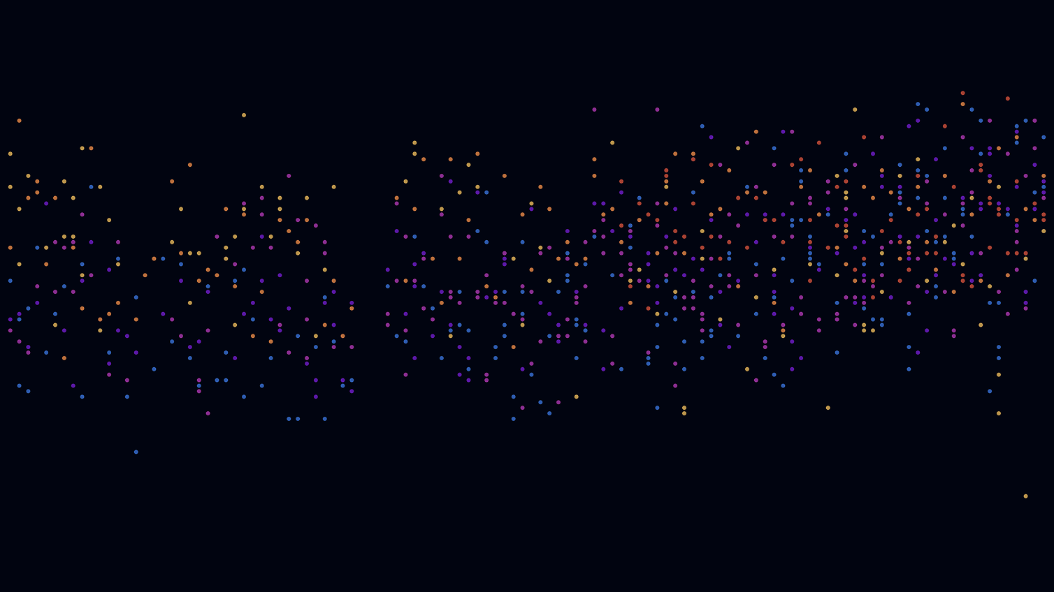
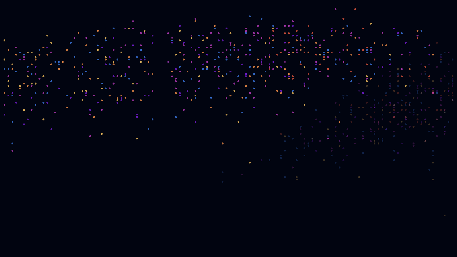
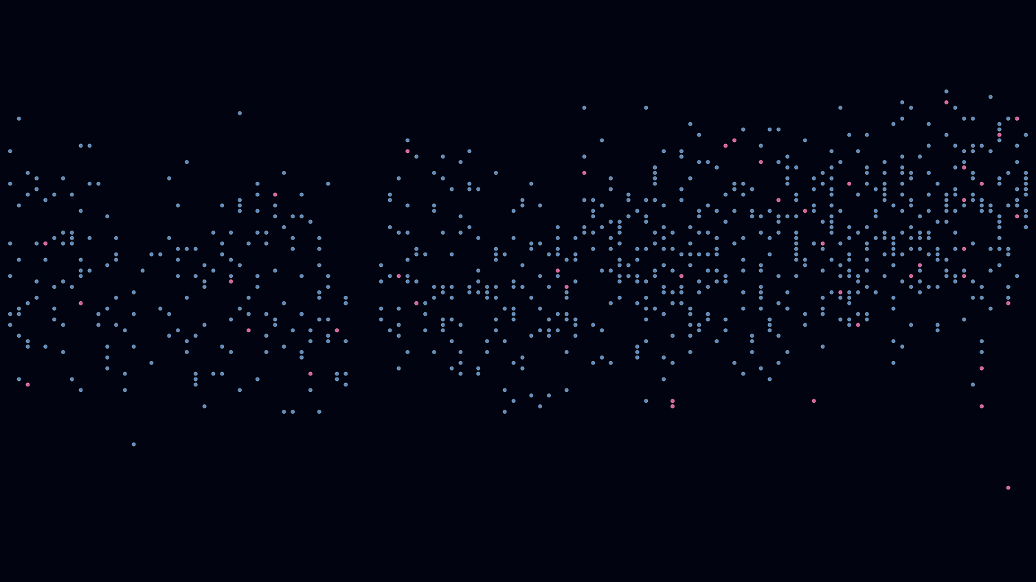
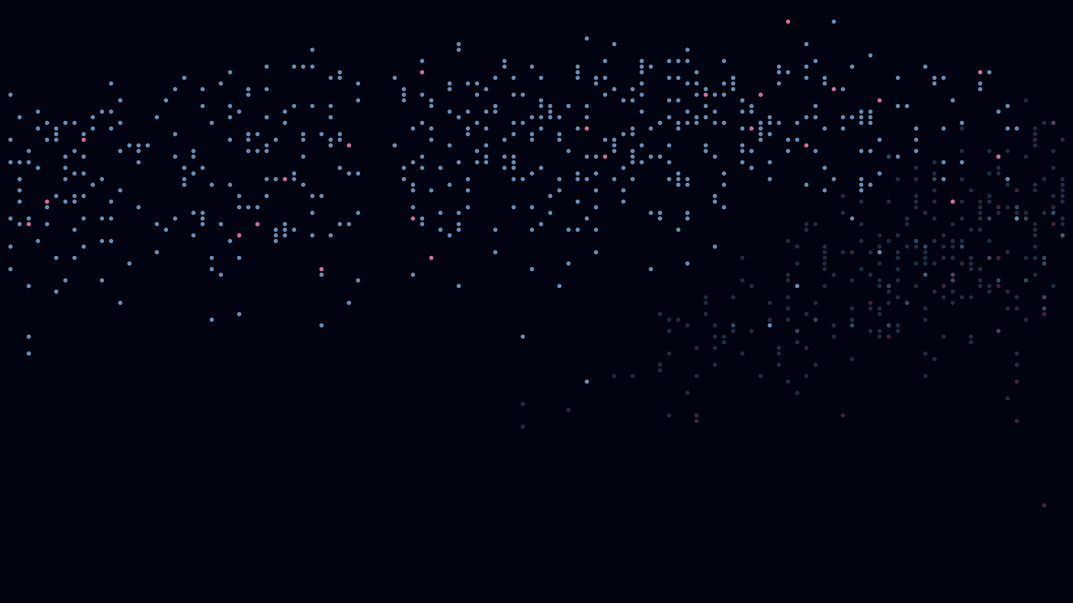
Age of Laureates
In this representation, the age of the prize winners at the time of winning the prize is compared. The X-axis shows the time dimension from 1901 to 2016. The award winners are arranged from left to right according to when they won the award. The Y-axis indicates the age of the award winners and ranges from 0 to 100 years from bottom to top.
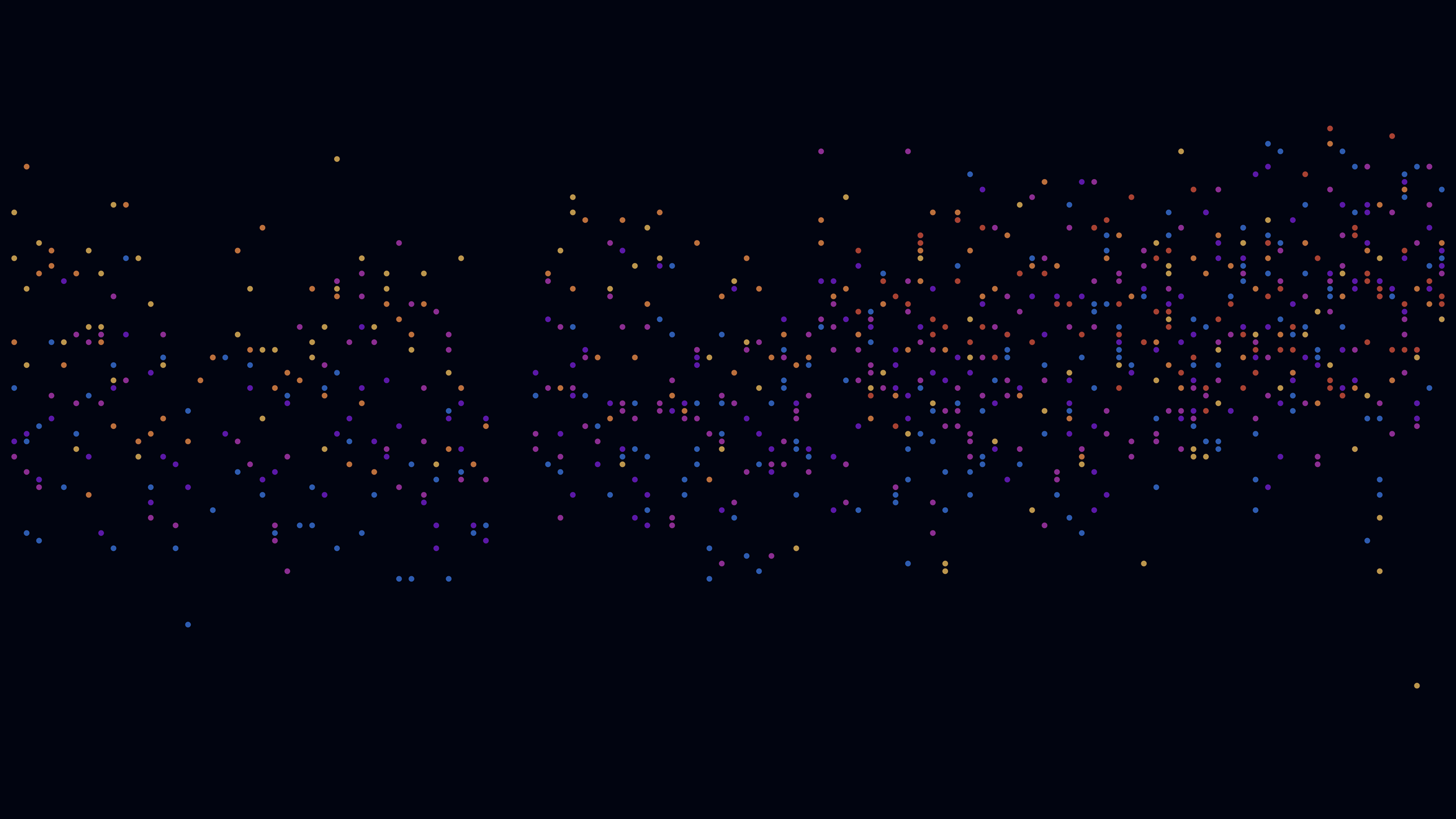


Age at birth
Age when winning nobel prize
Age at point of death
The first view shows the age of the candidates at the time of their birth, which seems banal but helps the user to classify the presentation in terms of content.
The third view shows the last stage of life and the age at which the award winners died. Those laureates who are still alive are moved into the background by a reduced opacity, as the focus is on the deceased laureates.